Bookiply Design System — A new foundation
Intro
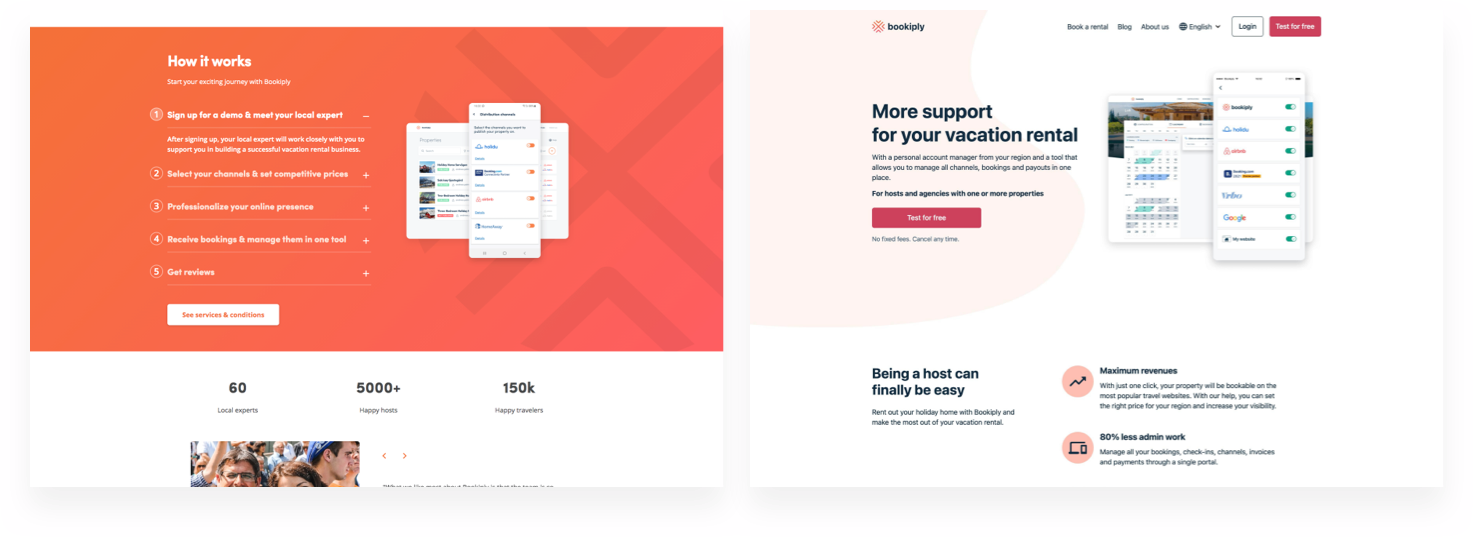
Bookiply is a holiday rental management tool that operates all around Europe. Homeowners can distribute their properties on different rental websites and handle their bookings within the same platform—a one-in-all tool used by many people.
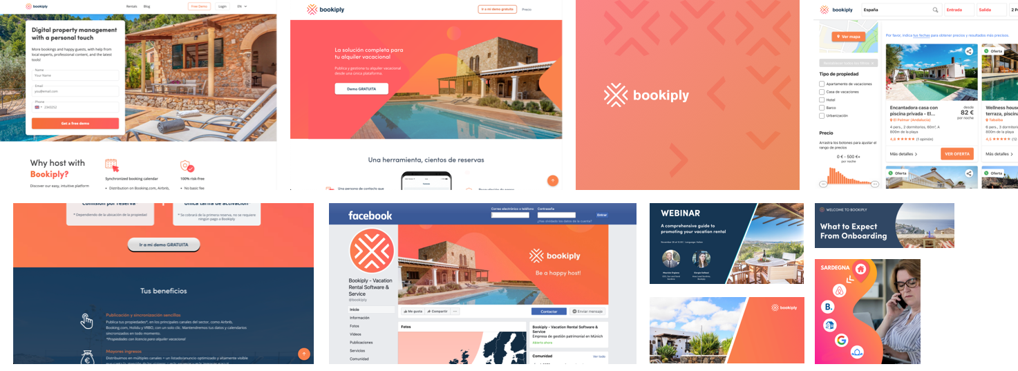
Different teams across the company used the brand differently, within multiple platforms and with different purposes. That resulted in a Frankenstein product with a lot of mismatches.
In late 2020, I led a project to redefine the entire Bookiply brand, whose main foundation was online platforms. My role was to create a design system that would allow us to build digital products that are simple, intuitive and easy to use. At the same time, unify the whole brand experience.
- Role: Lead designer
- Team: Task-force team together with a Content Manager, a Visual Designer, a Product Manager and two front-end developers.
- Timeline: Late 2020 – May 2021
The Problem(s)
The first thing we had to do was a long, hard look in the mirror.
Together with a branding designer, we compiled a myriad of examples of how the brand was currently used. In addition, we analysed different scenarios in which the brand was represented and how the communication was done.
We quickly realised the following:
- The brand was a Frankenstein. There were no clear guidelines on how to use the colours or the logo. It was anarchy of visual deliverables, and it needed an urgent unification.
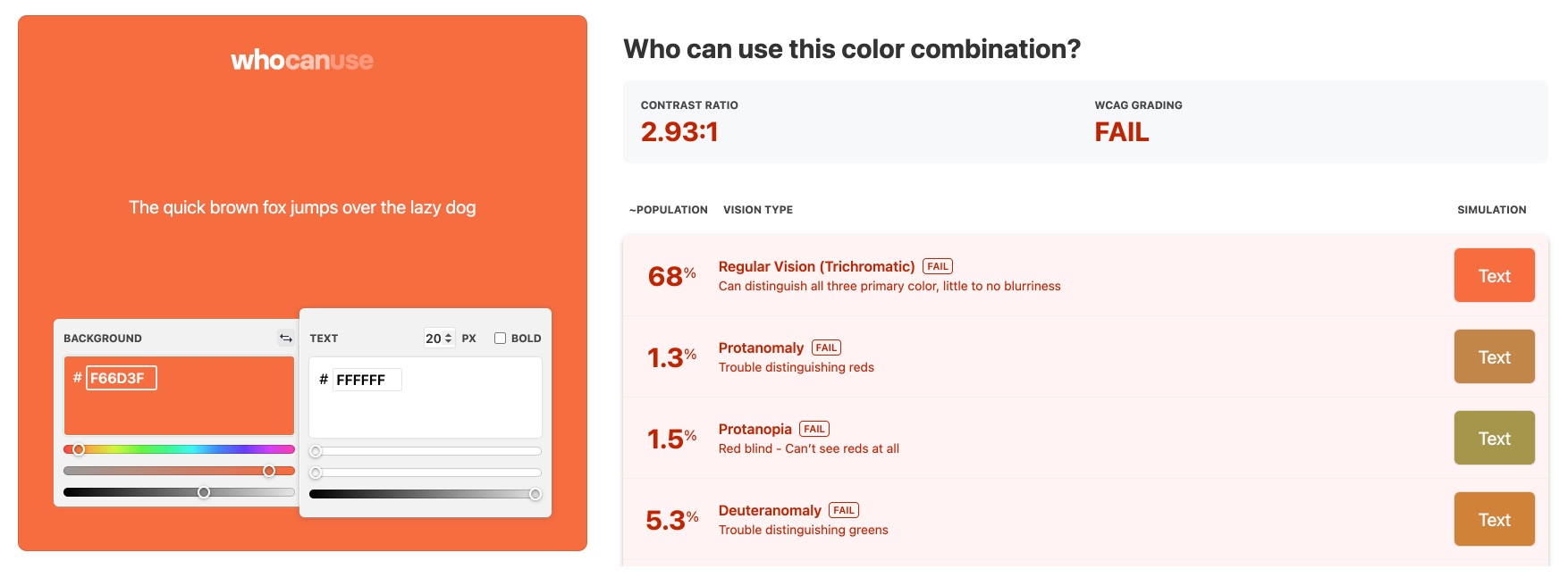
- Aggressive. The primary colours were a mix of harsh reds and high pitch oranges, making the whole look & feel very hostile and unwelcoming. Additionally, these arrays of colours were unaccessible on web mediums and interactive elements.
- No brand values. There was no clear differentiating point or any strong brand presence. The whole experience felt outdated and very unreliable.
Design Audit
At this stage, I also did a design audit on the main Bookiply website. My idea was to create a Design System based on best web practices, such as performance and accessibility. Currently, the usage of fonts and colours were not well optimised, and there was a lot of room for improvement.
Process & Redefinition
"Who are we?"
This was the first question we needed to answer.
We spent some time interviewing internal stakeholders as well as customers. We also did a vast benchmark of our competitors to see how they were positioning in the market. We needed to understand our mission and find clear values that would help us build a robust Design System.
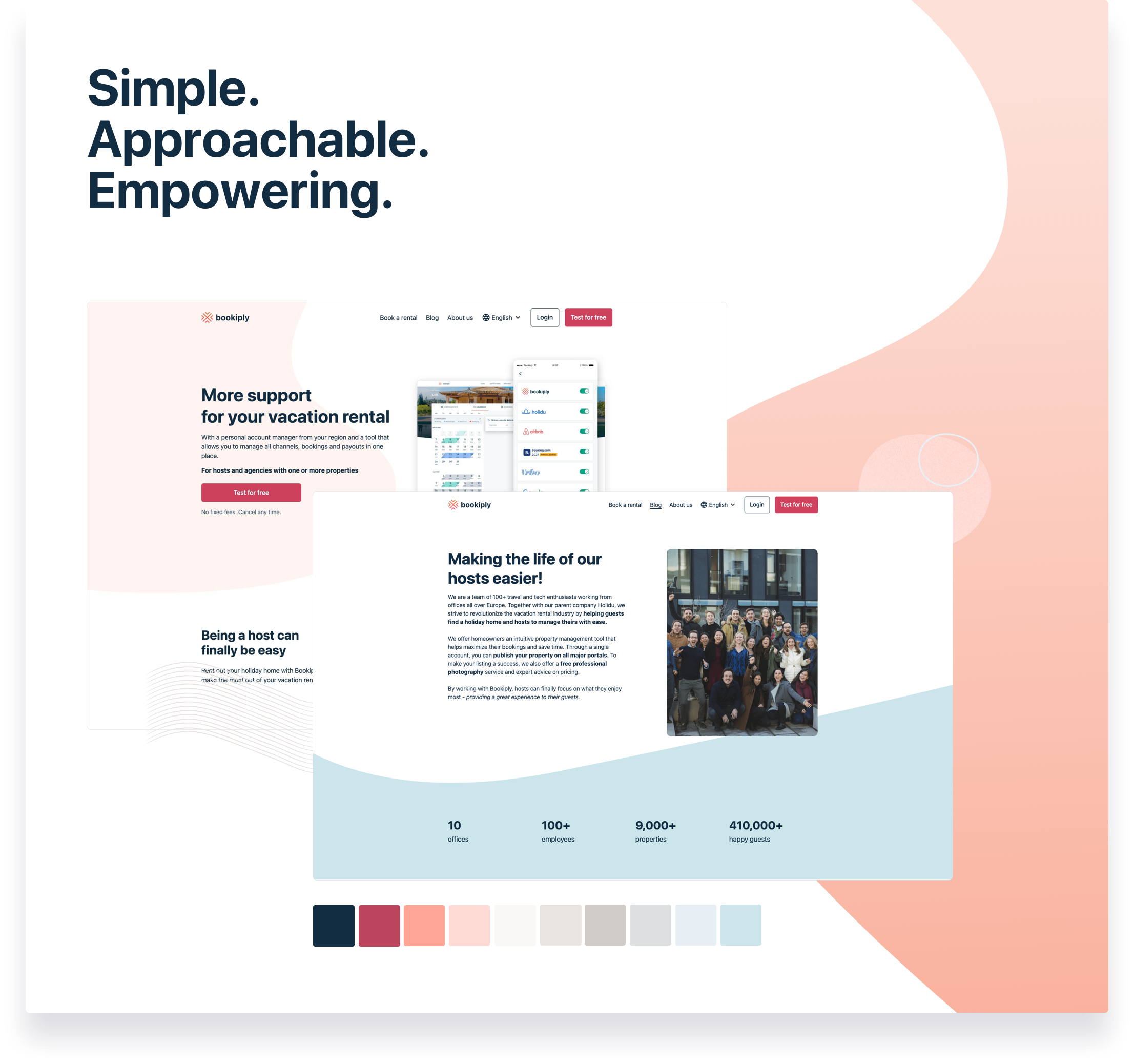
This whole process took some time but was essential. Finally, after few iterations, we came up with a new scheme of colours and fonts that would still be loyal to the original Bookiply essence but with a fresh and clean new look — it was time for a change.
Building a Design System
Bookiply is used by many people from a wide range of ages, locations, contexts and abilities. It is not a tech-savvy tool but rather a mainstream tool that everyone needs to wield.
With that in mind, I designed a down-to-earth Design System. Something that would allow us to build a product intuitive and straightforward to use, removing any friction between the user and the main actions they had to take on the website.
I started with the base design tokens (sometimes referred to as atoms) such as typography, colours and spaces and then moved to more complex UI components like the navigation, forms or footers.
Documentation
Design Systems are the best way to promote collaboration between designers and developers and help teams scale their products. But one can only achieve that with proper documentation.
For this project, I paid particular attention to how each design decision was communicated on the Design System — I wanted to avoid any misinterpretation and make sure that this document became a single source of truth.
I developed system embedded guidelines in the design file to understand the rationale behind the design choice.

Results and Learnings
The creation of the Bookiply Design System has empowered everyone in the organisation to launch new marketing pages rapidly and consistently and helped designers find UI areas of improvement.
Additionally, we removed old technical debt with this project and improved its overall performance, which helped the website load faster and boosted users' reliability and trust.