Improving the usage of the map feature
Intro
As a traveller, one of the essential aspects when planning a trip is to know where to stay. Whether you are travelling solo or with a big group, finding accommodation is probably one of the most challenging parts of your journey.
Holidu is a metasearch engine for vacation rentals that helps you find accommodation according to your trip or budget.
As part of the team in charge of the results page, I worked on a project to improve the map experience, so users can easily locate the properties within the region they are searching for.
The Process
The way I work could be easily defined in 4 significant steps: The Gathering, the Crafting, the Implementation and the Validation.
Gathering Information & Research
For this particular project, I did an extensive amount of User Research. Not only before implementing new features but also during and after. I relied on quantity and quality data to keep myself informed at all times.
These are some of the activities I carried on along the way:
- 10 User interviews
- 25 automated user tests
- 6 different a/b tests
- Stakeholder interviews
- Technical interviews
- Competitor analysis
The area of investigation was the map feature on the website. The scenarios ranged from users trying to locate their properties in a specific location to discover new points of interest. From all this investigation, I found 3 significant issues:
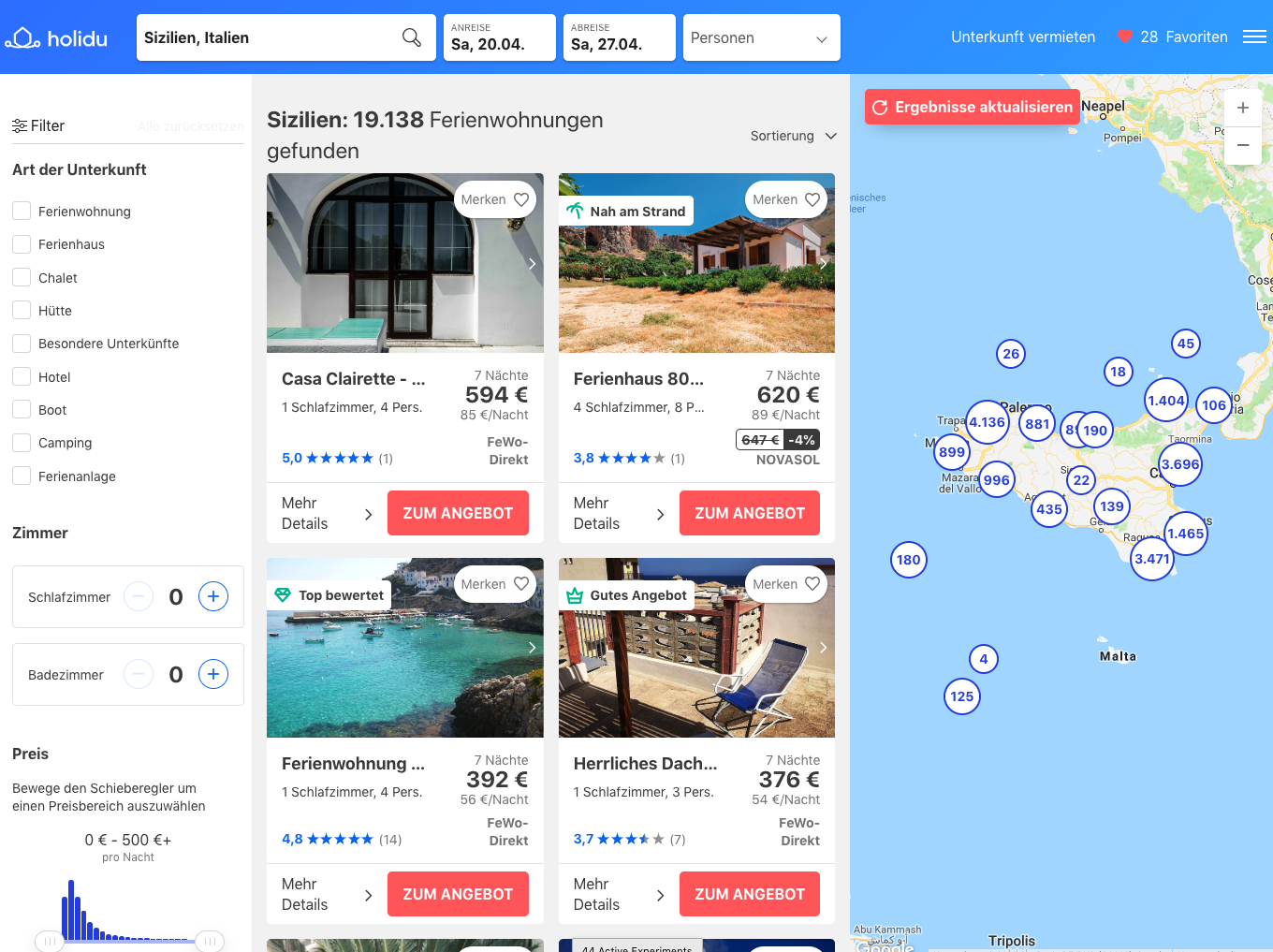
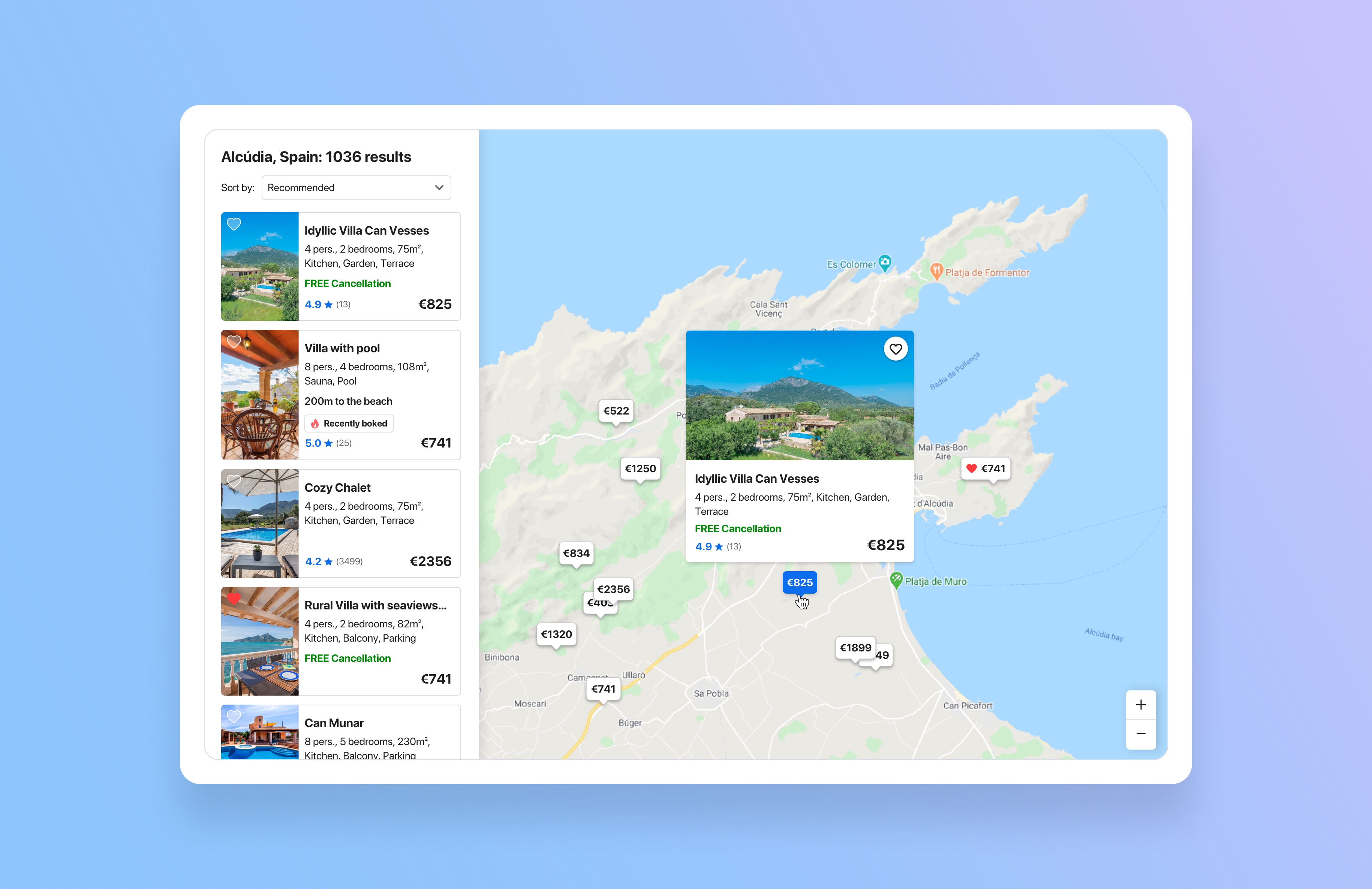
Layout and Interaction: The current page had a lot of clutter: Filters, list of offers and map were all in the same view, side by side. This was an issue, especially for people with tiny screens who could hardly interact with the map features.
Compare offers: Users didn't understand what the dots on the screen represented and had trouble comparing the different options. They had to make a huge cognitive effort remembering the information of each offer, so; eventually, they would give up.
Performance and trust: The map was really slow. We saw this when interviewing people who were not connected to the Wifi. There was a lot of frustration due to the slow loading of the offers. The general impression was that the website was sketchy and unreliable.
These three big pain points became the main goal to solve on our project, and my next task was to ideate solutions to improve them.
Crafting
I tackled each of the pain points by brainstorming, ideating and conceptualising different design solutions.
Freedom and Interaction
The first thing I considered was the space and layout of the current page: Filters, list of offers and map frame were all together, side by side. This created a lot of clutter and cognitive load, so I prepared several concepts to allow users to expand the map and be the only thing visible on the screen.
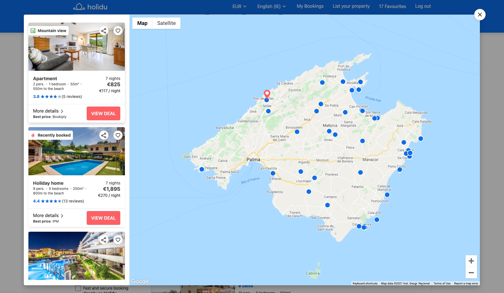
I tried different layouts and tested different screen sizes. Finally, I came up with a solution to give an entry point to the map by opening a modal box. This would allow users a bigger area of interaction.
On top of that, each offer would include a link that would open the map modal box with the offer in the centre of the viewport.
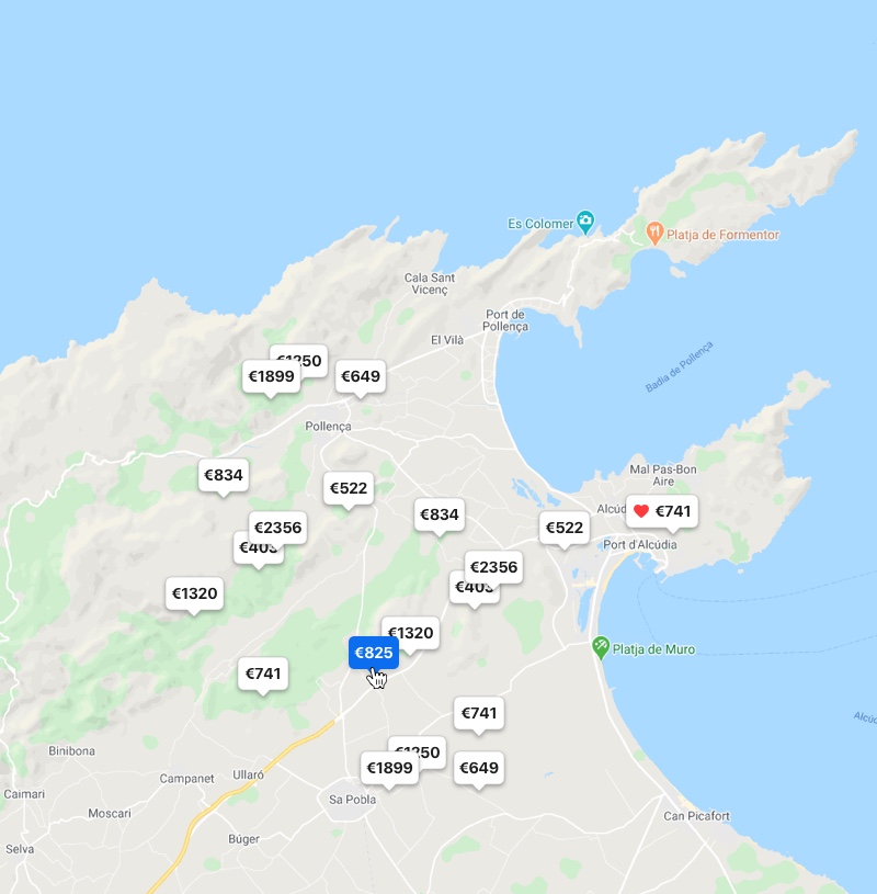
From dots to prices
One thing became clear during the user interviews: Price is the most important information when comparing offers. And in that sense, our current map was not helping users to compare easily.
People had to click dot by dot to retrieve all the information and had to remember by heart the prices. It was frustrating and time-consuming. So I develop a concept to replace the pins for the price information, with the most significant challenge being foreign currencies and edge cases.
Faster and smarter
I worked with the developers to improve the map's performance and speed from a technical and UX point of view.
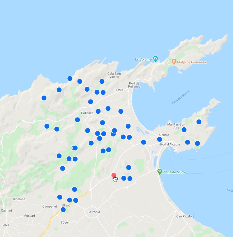
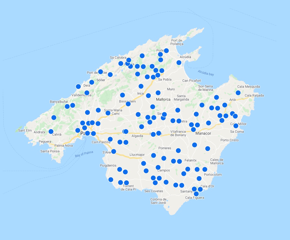
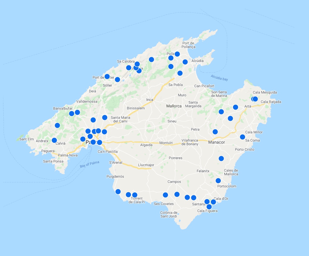
We reduced the number of offers showed at once— so users would have time to diggest the options gradually and reduce the cognitive load.
To help users understand what regions were more popular than others, we distributed more offers strategically in some regions of the map, giving them proper guidance.
Results at first glance
All these new concepts and improvements were gradually introduced to our product via a/b tests. Although some things are still in the pipeline, we already saw some immediate progress on the numbers:
- Visibility: 8% increase on users opening the map
- Decision-making: 3% conversion increase of affected users
- Performance: Speed improvement and faster loading times
Some key takeaways
This project has been an absolute learning exercise for me in many ways, but there are a couple of things worth highlighting:
Iterative progression: Having a vision of a whole new concept is fantastic, but even better is to reach there step by step. The map that we currently have online is built from little successful features that are helping users to locate and compare offers better.
Collaboration: Working in a cross-functional squad allowed me to peer you experts from other disciplines: Working with data with the Product Managers, understanding technical constraints with the developers, etc. This whole project was done with many heads working together towards the same goals.